It's no surprise to the readers of this blog (all two of you) that I enjoy photographing the comings and goings, whimsy, beauty and unique delightfulness of Santa Monica. My cameras (iPhone 3G and Olympus FE-140) often don't capture what I see as well I want but Santa Monica never disappoints.
 |
| A beautiful day at the Santa Monica beach. |
 |
| Santa Monica state of mind captured! |
 |
| Santa Monica summer sky |
 |
| Optometrist's clever window display! |
 |
| I don't know what these are but they're lovely. |
 |
| Farmer's Market Birds of Paradise |
 |
| Tiles on Santa Monica's City Hall entrance display the color and movement of Santa Monica. |
For the past few years I've photographed the results of Santa Monica's Beauty-and-the-Beast development. As a 20+ year resident of this beautiful city, I used to be a proponent of "zero-development" here. However, after reading fellow resident, Frank J. Gruber's clear-eyed, practical observations about urban development in his book "Urban Worrier", I adjusted my opinion -- a bit. I have a better appreciation for a city's need to evolve as decades pass in order to keep up with the demands of a vibrant sea-side city like Santa Monica.
The single greatest visible impact development has on the public is on its architecture. There are thousands of other details and issues but the architecture of a building's facade afflicts or enhances a city and its public for decades. Like any city of merit, Santa Monica is more than a bunch of people living, working, existing in buildings. It's a state of mind for many, rather than just a destination. Residents can feel pride of place. I feel very lucky to live in Santa Monica and now that I've lived here for a generation, I'm entitled to say, I'm proud of this city.
 |
| Here, the trees capture the breezes. |
 |
| Paths that lead to a sense of place. |
 |
| Reminders from an earlier era that utilities don't have to be utilitarian in design. |
 |
| The moody Santa Monica marine layer |
 |
| The starfish are sultry and alluring. |
 |
| Cyclists customize their ride in the joyfulness of Santa Monica. |
 |
| Santa Monica winks good night. |
While I admit that reasoned development keeps a city from stagnation or decay, I still hate seeing decades old, well crafted, homes bulldozed and replaced by multi-resident, high-rise dwellings with no yards or sense of being part of the city for which they provide shelter.
 |
| House on the west side of 11th near Wilshire Blvd. |
The reason for this post: I'm deeply disappointed, even angry, at the same, uninspired architectural designs repeatedly approved by Santa Monica's Architectural Review Board (ARB).
In Santa Monica, the ARB gives, among other things, final approval for the physical look and style of new buildings. I'm sure that's a great over-simplification of the ARB's responsibility. The process for final design approval is long, arduous and, in my opinion, worthy given that the ARB is responsible for Santa Monica's architectural character as new buildings go up. Public services notwithstanding, architecture is a declaration of a city's view of itself in the world.
 |
| Let's start with the Big Brown Blob of a high rise somewhere on Santa Monica Blvd. between Lincoln Blvd. and 4th St.. The eye of this beholder-blogger thinks this is an ugly building with zero sense of Santa Monica. |
 |
| On the same north/south block as the Big Brown Blob is an entire block of high-rise boxes, with no sense of place or distinction between Santa Monica Blvd. and Broadway on 6th or 7th St. (they all look so much alike I'm not sure) with only two ever-graceful palm trees as balance. |
 |
| Approved for the NE corner of Lincoln Blvd. and Broadway. It will be on the same block as the ugly horizontal green stripe building that's almost finished (photograph follows). |
 |
| A more recent variation on what's going in on the NE corner of Lincoln Blvd., and Broadway |
 |
| Almost finished high-rise box with puke green horizontal stripes under construction on NW corner of Broadway and 9th (referred to above). |
 |
| The color scheme for this high-rise seems to reference Santa Monica's beautiful orange sunsets and the grey mist of Santa Monica's June-gloom marine layer (which was rolling in as I took the pic). |
 |
| Square, square and more square blah. |
 |
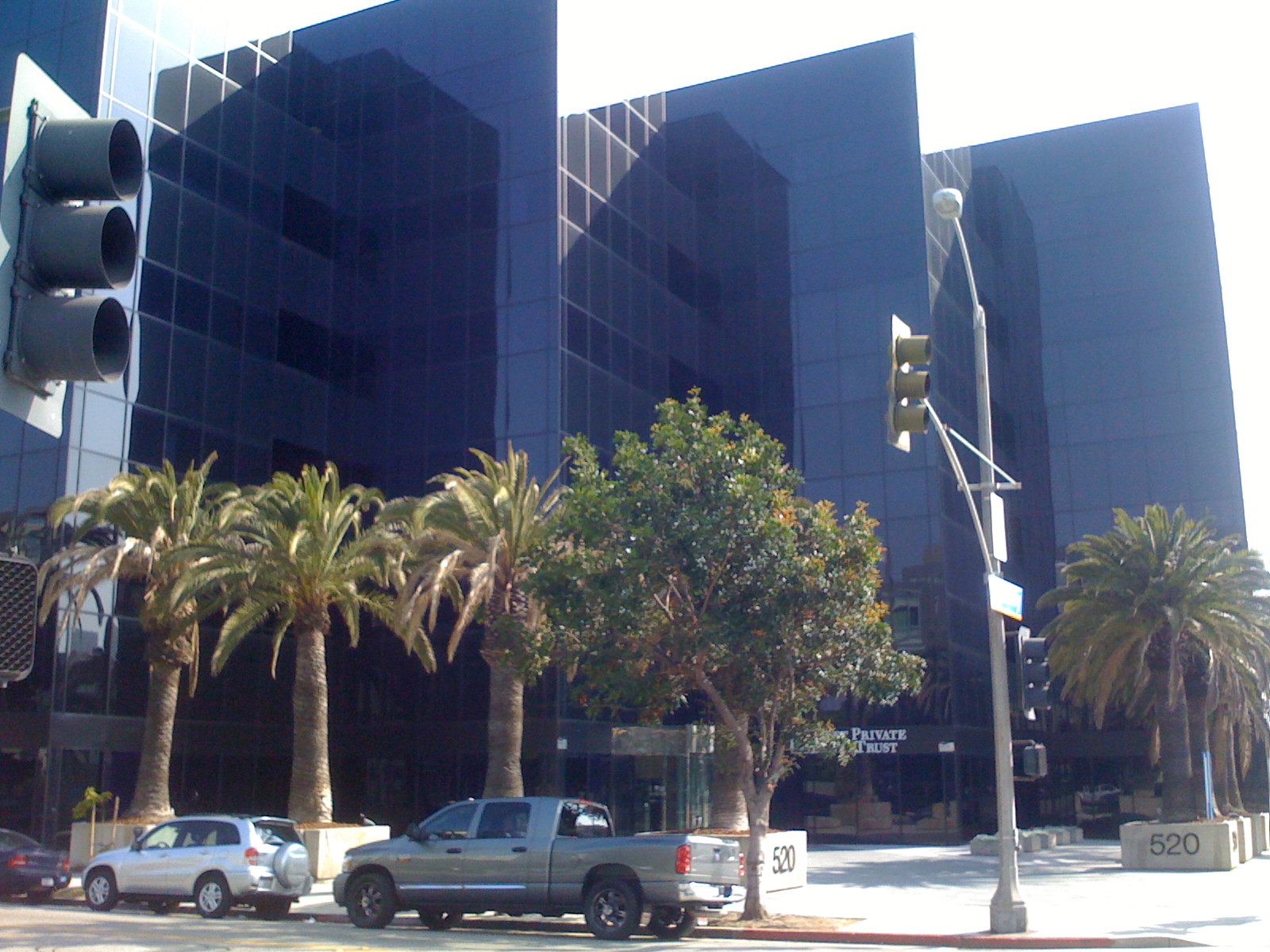
| I can't even recall which block this is but it all the same squares, rectangles and straight lines. Not even palm trees to soften the harshness! |
 |
| This is on Broadway somewhere between the new (and square) open air Santa Monica mall and Lincoln Blvd. but I can't recall exactly where. |
 |
| Ooooh, how clever: squares and rectangles now with balconies. |
 |
| This is a little more interesting with a mirrored facade and shadow-making angles. |
Oh, and here's the very expensive, much anticipated, new, and not-so-much-improved Santa Monica Mall:
 |
| Broadway and Third St. (the Promenade) entrance to the open air Santa Monica mall full of right angles. It could have been erected any where. |
 |
| SE corner of Broadway and 6th |
 |
Except for those who live in Santa Monica, who in the world would think this is a fairly new block of buildings in Santa Monica, CA? These will probably look like slums in about 10 years -- then the ARB can approve even taller variations of square rectangles to replace these (please, no!).
In my dream world, members of the ARB read my blog so, my request to them is: please stop -- stop today -- just stop approving all these right-angle boxes that could be anywhere on planet earth and demand architects incorporate the soul of Santa Monica in their designs. Require architects walk (or bike) at least a percentage of Santa Monica's 8.2 square miles to get a sense of its unique qualities and heart so designs can be submitted that look like they could only exist in Santa Monica. Designing with inspiration and creativity is not any more expensive than designing the same boring boxes but it's a far more noble legacy for Santa Monica and its ARB.
To be fair, not all the new architecture is ugly. Sometimes the ARB gets it really right and I thank them but the vast majority of new architectural designs being approved by the ARB are the same boxy shapes, top-to-bottom with no trim or design to soften or interest to attract the human eye. Here are two favorites of mine: |
 |
| This perimeter fence along Colorado (between 6th and 7th Streets) is part of the new bus terminal. It's particularly beautiful and in keeping with Santa Monica at night (reminds me of the ocean waves and azure skies of summer). |
 |
| Relatively new commercial building on the NW corner of Colorado and 2nd St.; one look and we know we're in a sea-side town. I still won't eat at McDonald's but I'm proud of this building. |
Now that I have this out of my head and into my blog, in future posts I'll publish photos of some of the elements of Santa Monica shape and form that we, the public, should expect to see in the architectural design approved by the ARB.
A final note, none of the square buildings in this post are parking structures -- which one might excuse for being unimaginative, right-angled edifices -- all of which makes what's been done to the look and ambience of Santa Monica that much sadder.


Dee, while reading this it occurred to me that I have a black & white framed photograph in my living room from a visit I made to Santa Monica nearly 10 years ago. I believe it is a square! What sticks in my mind most from that visit was roaming around an area that was revitalized with restaurants and shops, only to be accosted by homeless people at every turn. Very uncomfortable.
ReplyDeleteOrlando is the home of change--living here for 50+ years I've seen beautiful buildings torn down to make way for "modern" ones.
Any chance you have more pic of the "Optometrist's clever window display?"
ReplyDelete